Adobe Illustrator (Ai) - Column Graphs
Using Adobe Illustrator for data visualisation
NOTE: Click on each screenshot to enlarge them. In each set of images, the first screenshot will be from Windows 10, the latter in macOS Big Sur. Interchange Ctrl/Cmd (⌘) keys for shortcuts depending on your operating system. Any further differences will be noted
Configuring Your Artboard
Once you open the program, you'll reach a welcome page:
Create a new project. As this is a demo, set the artboard to 2048x2048 pixels, which should be plenty of space to work with. The other settings won't affect anything significantly and can be left as is.
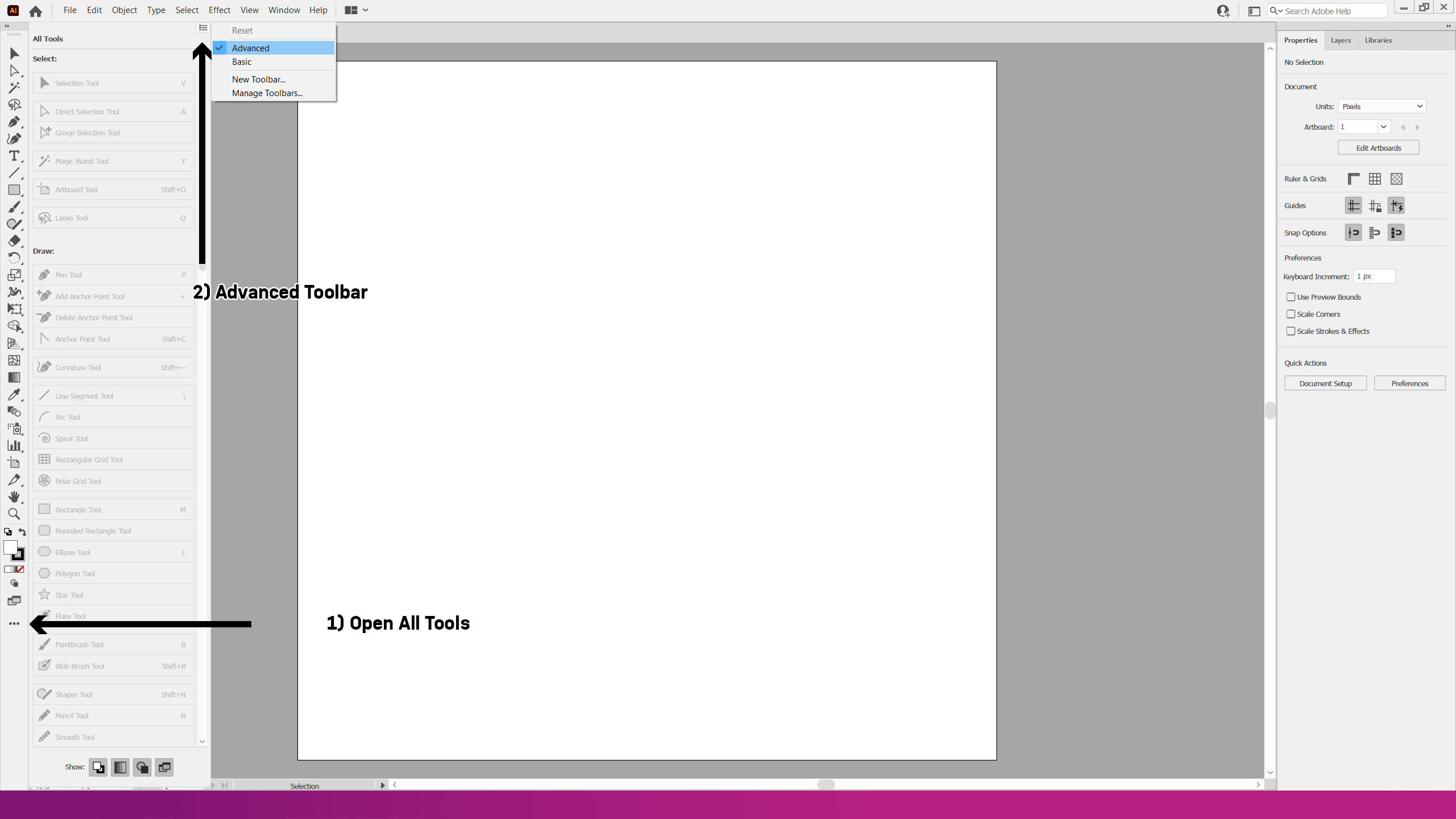
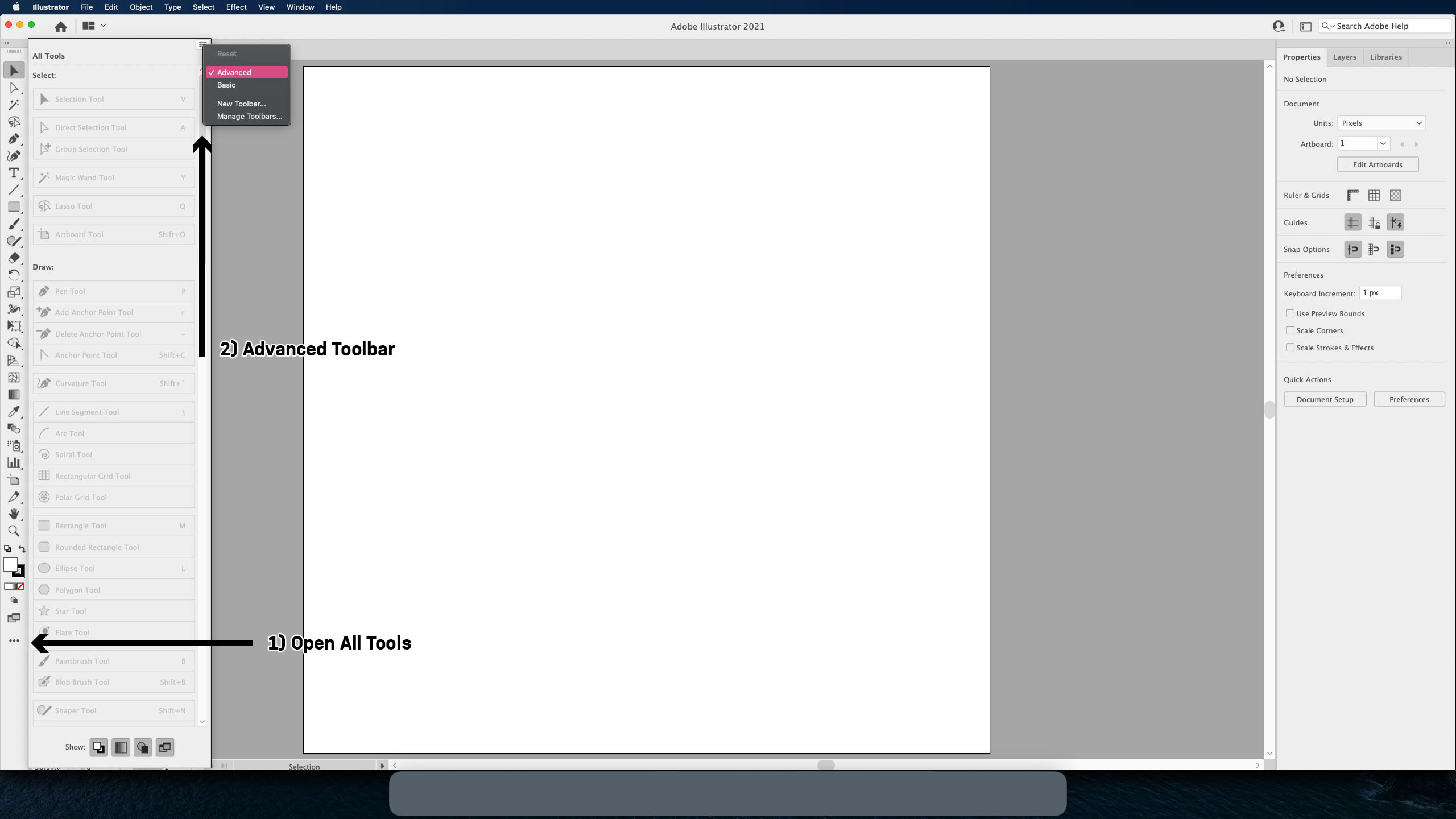
The first step is to change your toolbar. First, open the menu with the last button (three dots) on the toolbar down the left, and open the menu in the top right corner of the pop-up and select 'Advanced Toolbar', as below:
Creating a Column Graph
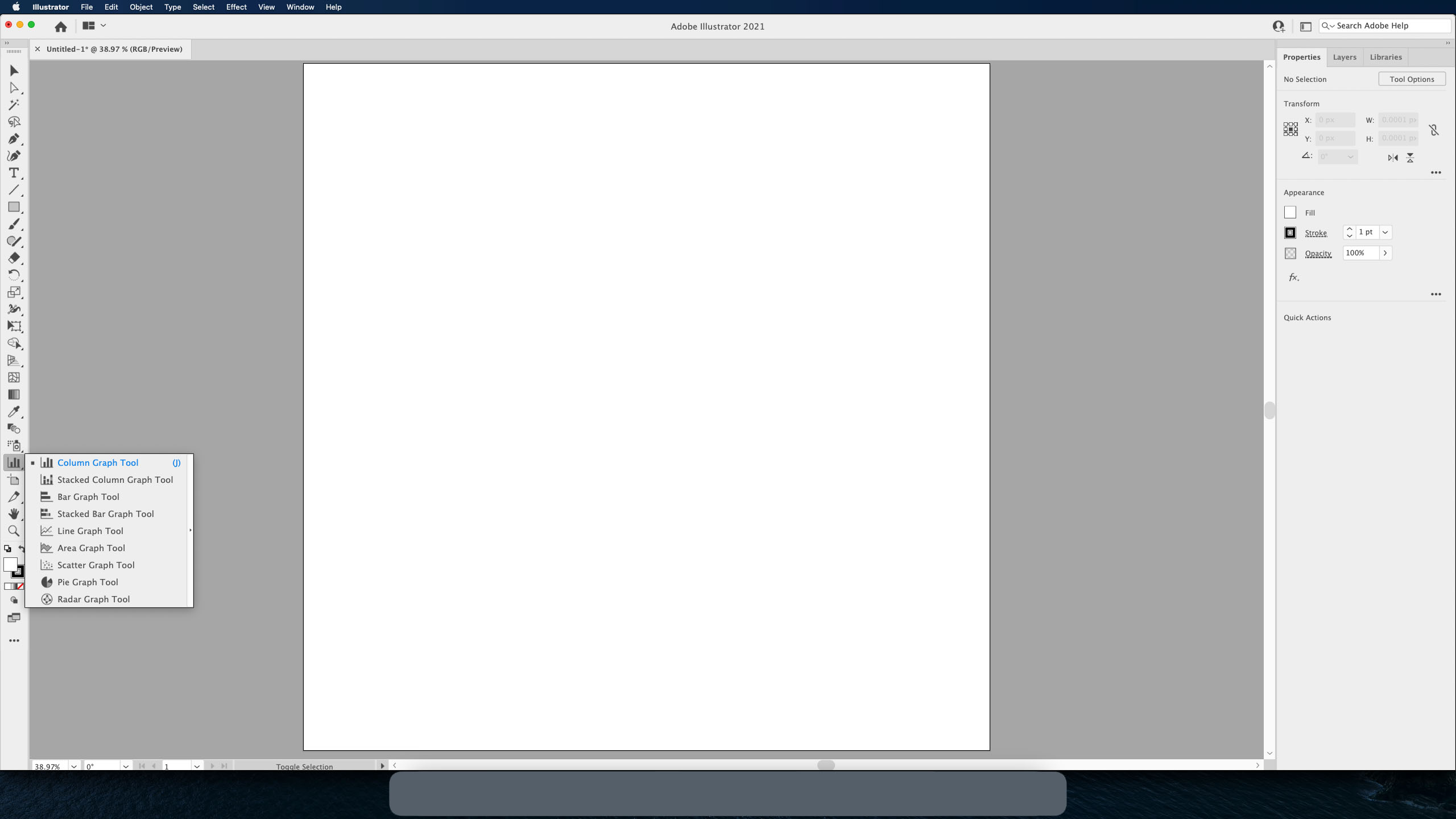
Your toolbar will now be expanded to fit more shortcuts into it. One of these is the Column Graph Tool (shortcut: J) - select it from the menu:

Now, click and drag on the artboard to insert your graph. The graph will be the size of the shape you have just created. Once you let go, a pop-up menu will appear, as below:
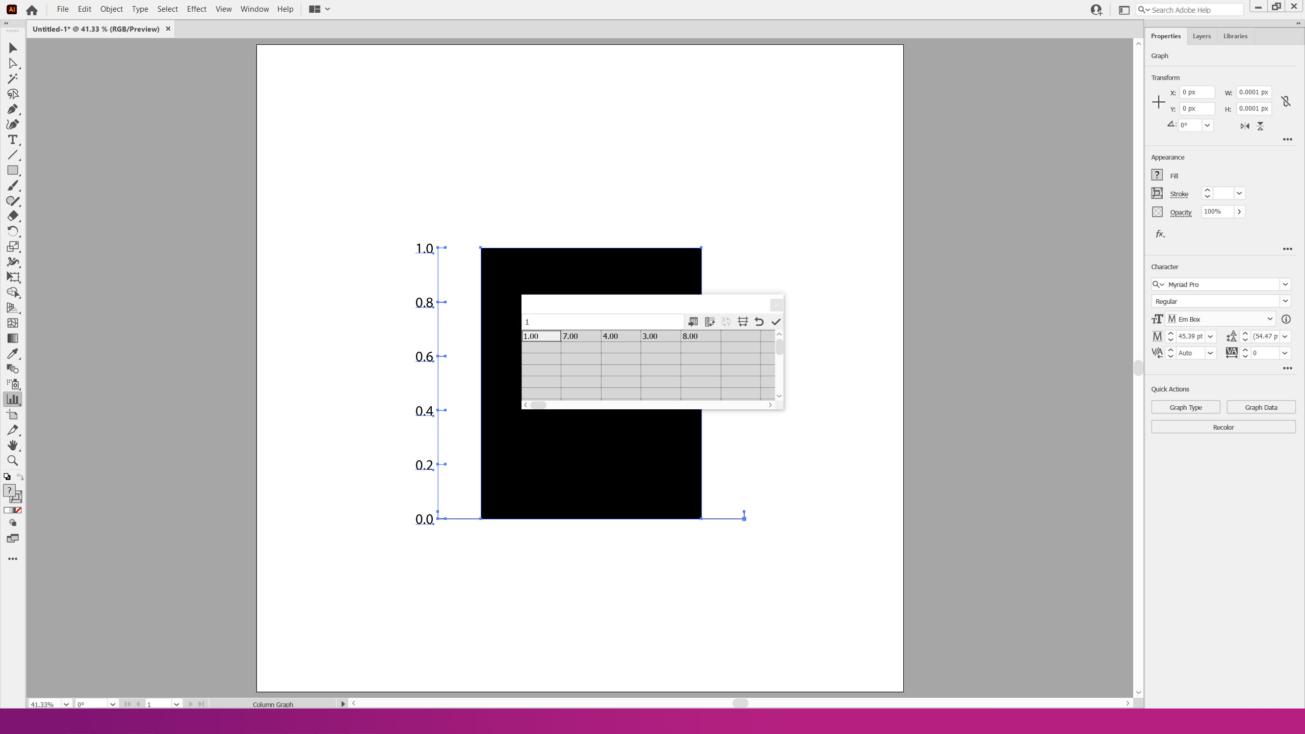
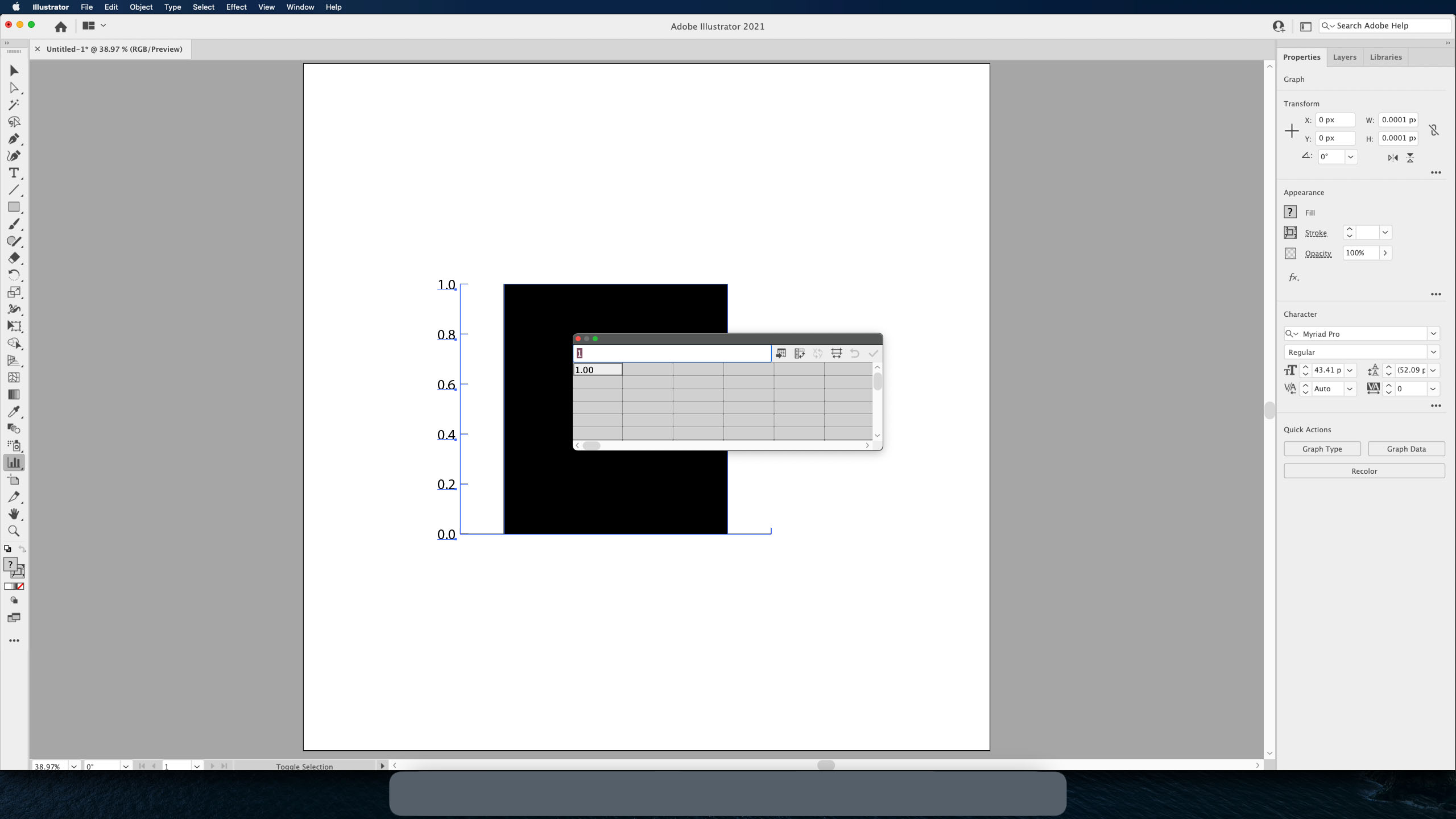
You can enter your data in the cells, identical to Microsoft Excel. To import CSV data, the first button next to the text area will allow you to import directly into Illustrator
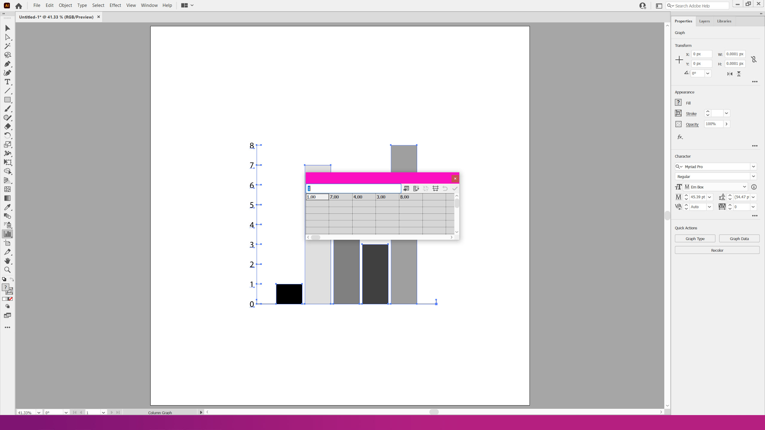

Note how data entered in the same row will differentiate colours by default, but data in the same column will remain black, as above
Press A to select the Direct Selection Tool once the data has been confirmed. Select each column individually to bring up the Properties menu in the right sidebar:
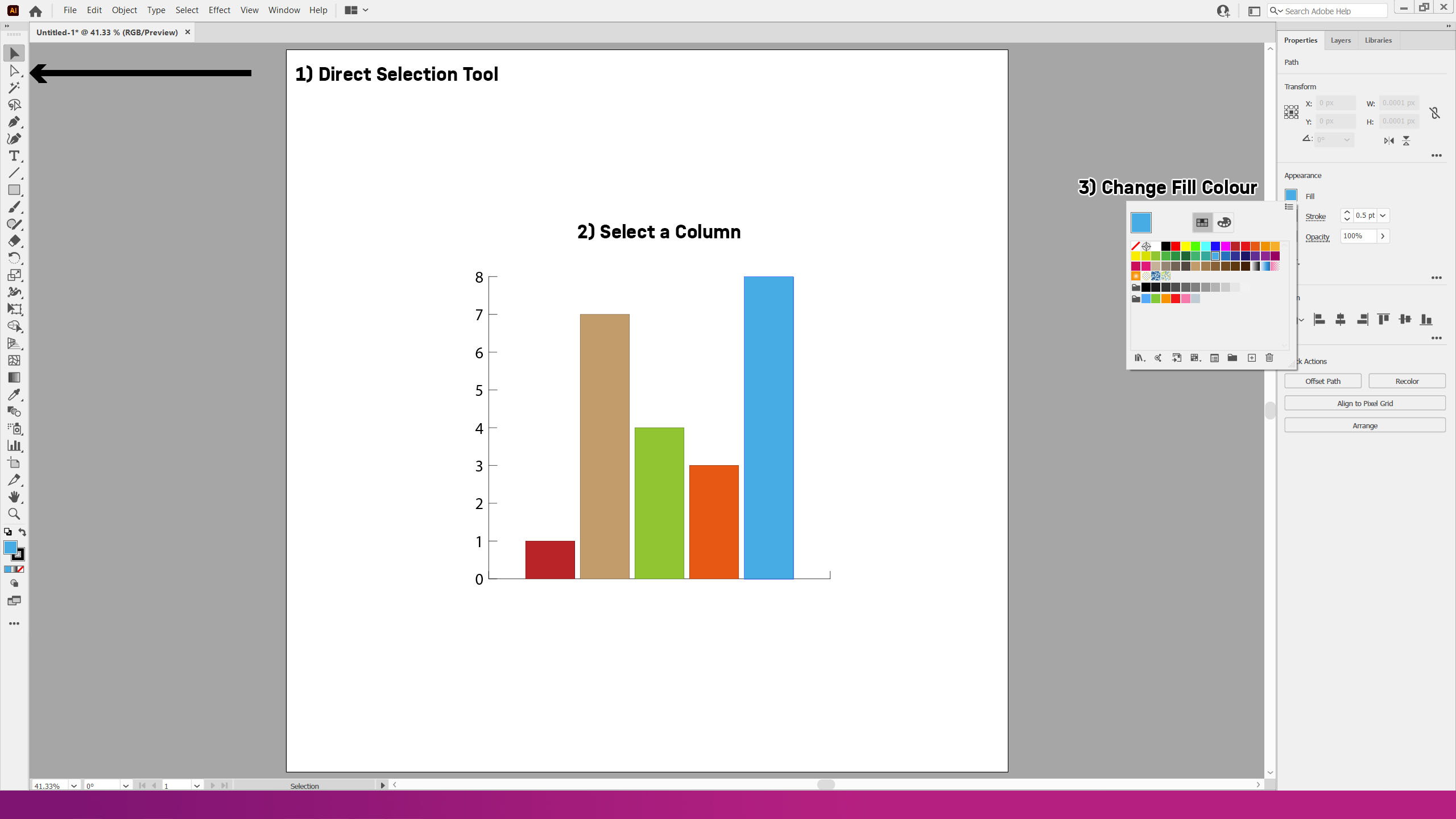
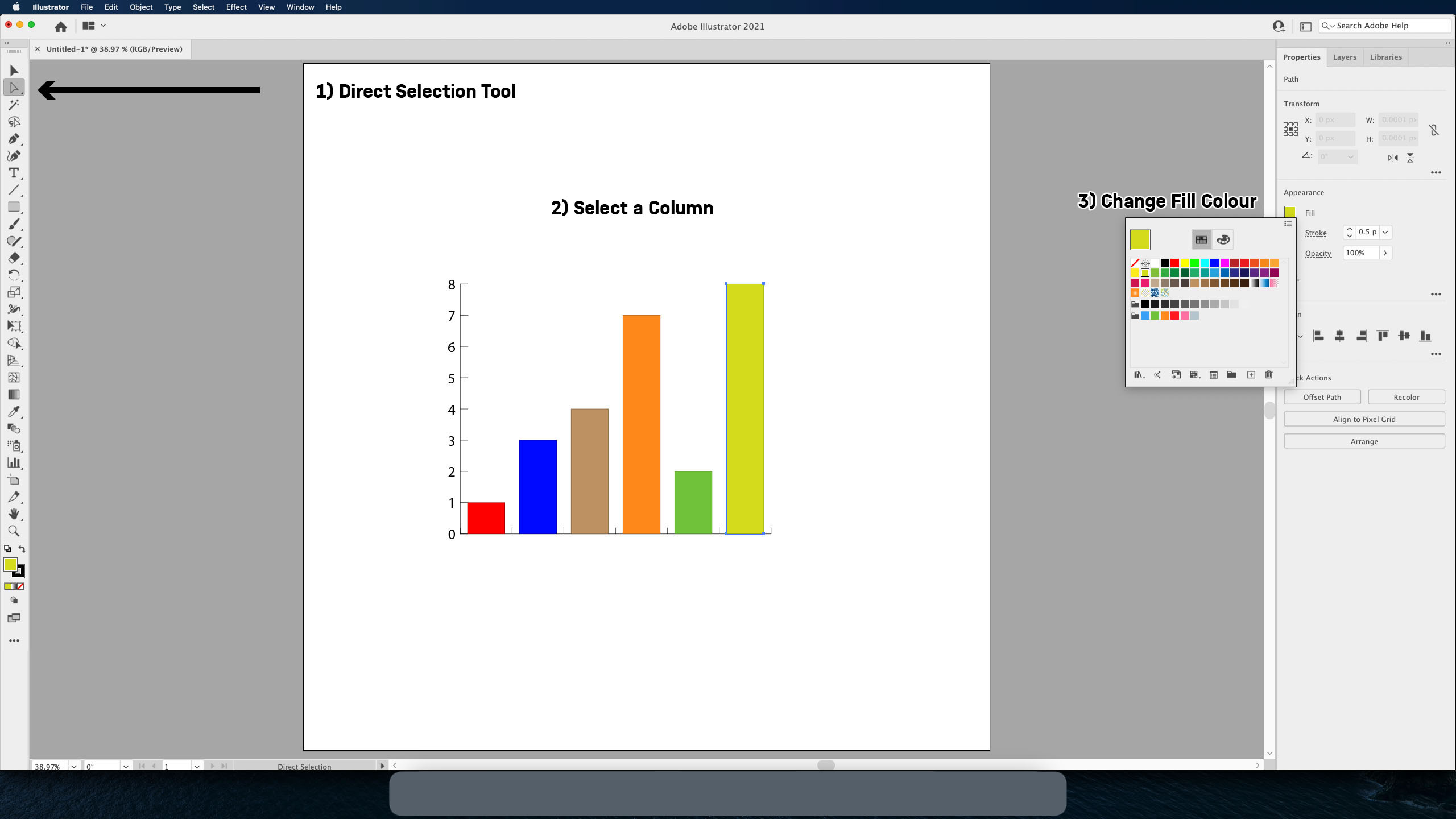
Change the fill colour, confirm, and repeat for the rest of the columns
Converting Graphs
You can change the above graph into a different visual display by using V to select the Selection Tool then right-clicking the graph and selecting type as shown:
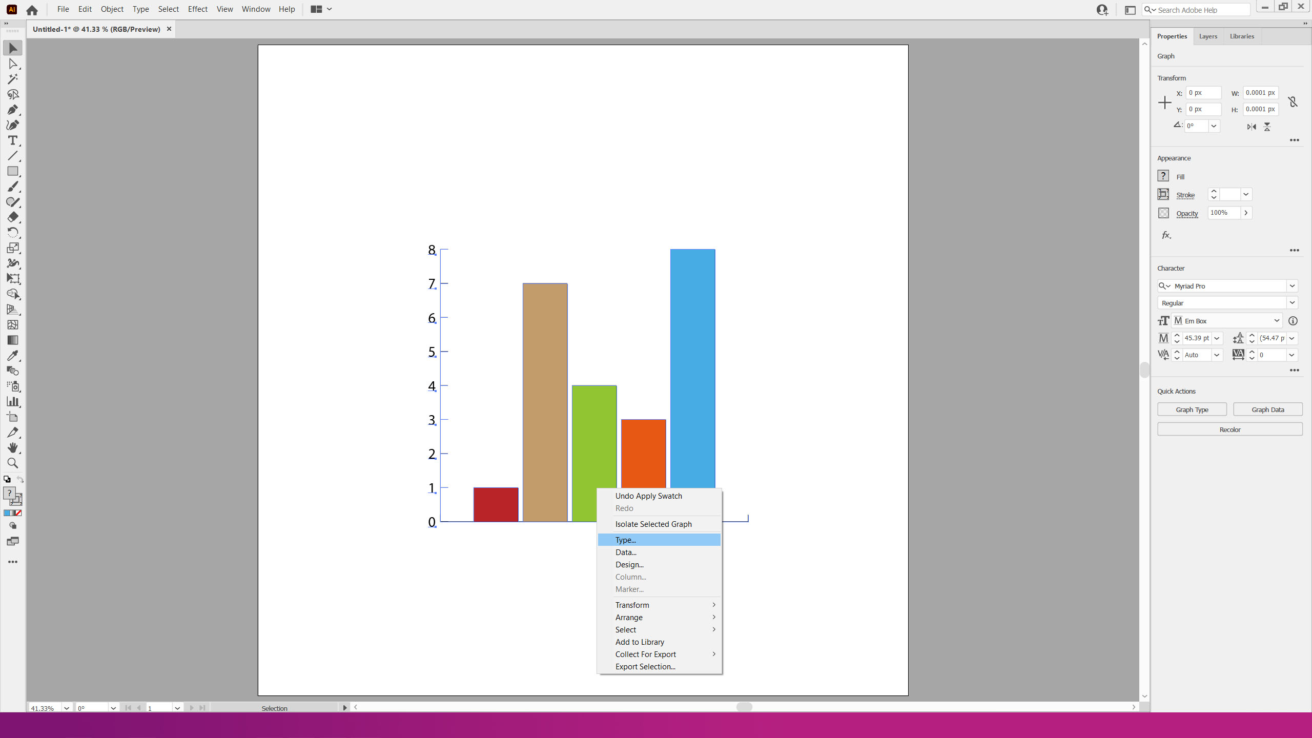
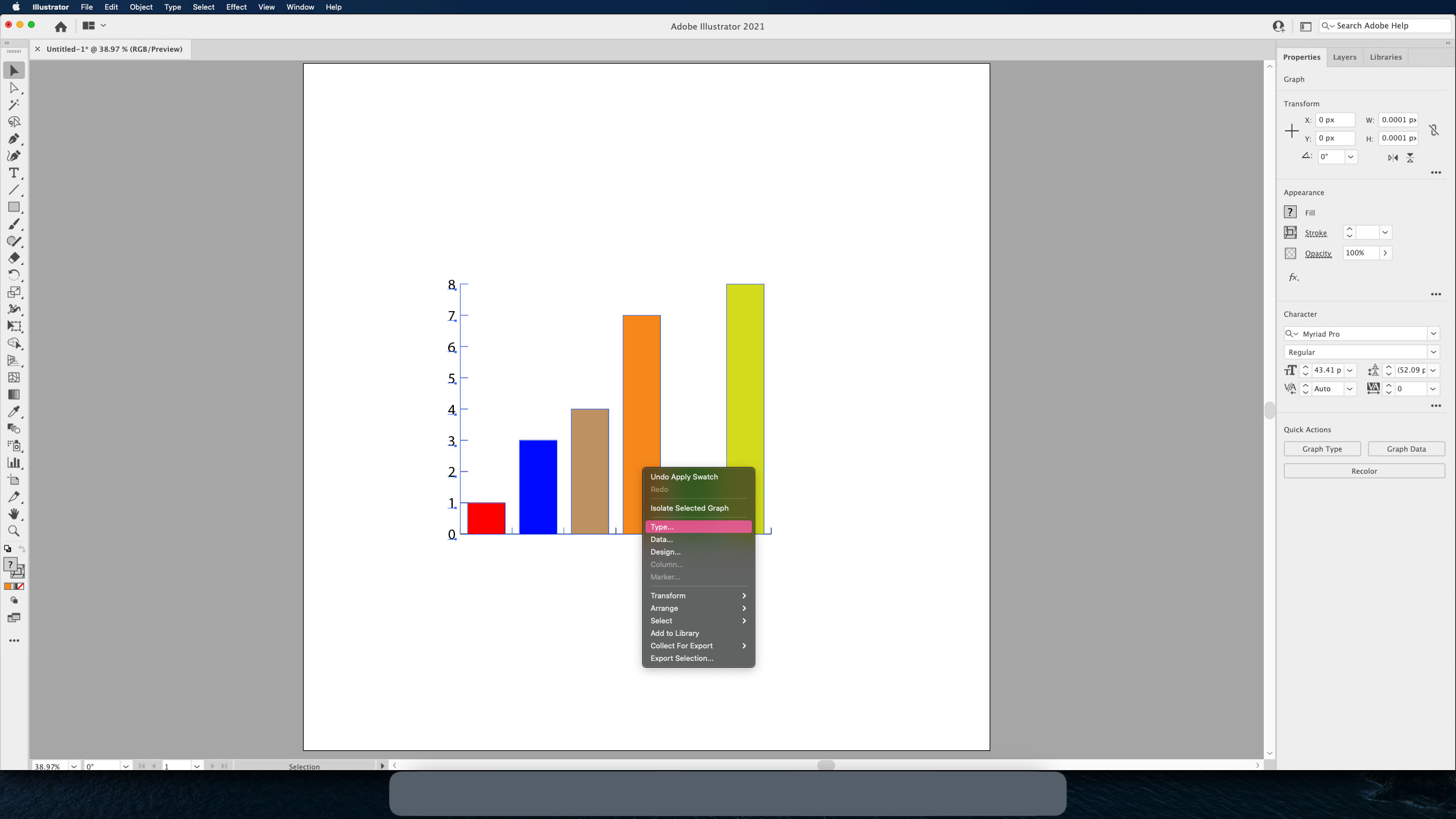
It will display a pop-up window:
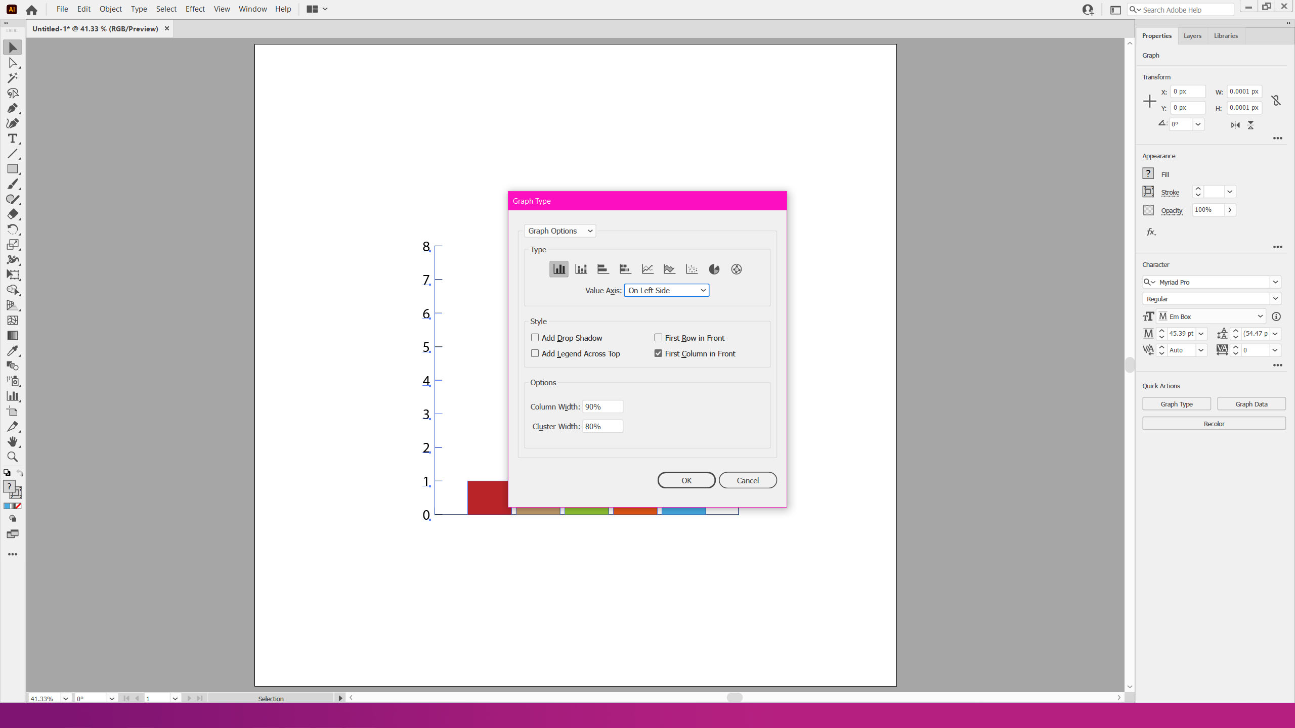

Each of the icons represent the graphs Illustrator can support using this tool. Your data will be translated into the format you have selected. These include stacked graphs, bar graphs, pie graphs, and scatter graphs.
Using the Direct Selection Tool (A), you can edit each element of your graph using the properties tab on the right. The selection tool (V) will let you transform your graph as a whole